I built a small accessibility audit tool for client work. This week I pointed it at my own site. Here is what it found, what I fixed, and where the tool was wrong.
The setup.
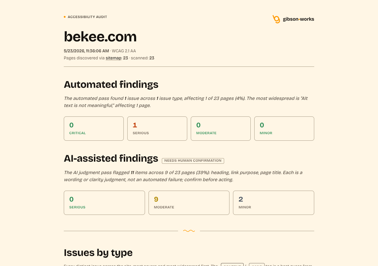
I’ve been building an accessibility audit tool that uses three lanes. axe-core handles the calls automated tests can decide. Code-only deterministic checks handle the items axe doesn’t cover. An AI judgment pass handles the human-judgment half that no tool can ever fully reach: link purpose in context, heading clarity, the difference between alt text being present and alt text being meaningful. Every finding is labeled by lane so anyone reading the report knows whether the call was mechanical or a judgment.
The tool was built to run on client sites, but the most useful move with any measurement instrument is to calibrate it. So this week I ran it on bekee.com.
What it found that I needed to fix.
The list was long.
The mobile menu nav links.
The mobile menu’s link items wrapped their titles plus their descriptive subtext inside a single anchor, which meant the accessible name of each link was “About Who I am, and how I work.” while the header navigation’s accessible name was just “About.” Same destination, different names. That’s a classic SC 3.2.4 Consistent Identification miss. The fix was structural: aria-labelledby pointing to the title span, aria-describedby pointing to the subtext span. Screen-reader users still hear the subtext as description, but the accessible name matches everywhere.
<!-- Before -->
<a href="/about/">
  <span class="bk-num">01</span>
  <span>
    <span class="bk-label">About</span>
    <span class="bk-sub">Who I am, and how I work.</span>
  </span>
</a>

<!-- After -->
<a href="/about/"
   aria-labelledby="bk-label-about"
   aria-describedby="bk-sub-about">
  <span class="bk-num">01</span>
  <span>
    <span class="bk-label" id="bk-label-about">About</span>
    <span class="bk-sub" id="bk-sub-about">Who I am, and how I work.</span>
  </span>
</a>
The screenshot alt text.
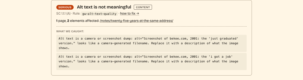
A 2001 Wayback screenshot in one of my notes had a 326-character alt attribute. The content of the alt was accurate; 326 characters belongs in a figcaption, not in an alt. The fix was a short identifying alt plus the rich description in a visible <figcaption>, which also helps sighted readers parse a dense screenshot they can’t easily peer at.
// Before
alt="The bekee.com homepage captured in 2001: a cornflower-blue page
with broken-image placeholders where the navigation should be, and a
white box reading, all in lowercase, that I just graduated and am
looking for a design job with a company of intelligent people I can
learn from."

// After
alt="Screenshot of bekee.com, 2001: the 'just graduated' version."
<figcaption>A cornflower-blue page with broken-image placeholders
where the navigation should be, and a white box reading, all in
lowercase, that I just graduated and am looking for a design job
with a company of intelligent people I can learn from.</figcaption>
The /writing/ archive hierarchy.
The /writing/ archive listed each article as an <h3> under the page’s <h1>, skipping <h2> entirely. The fix was bumping the post-title block from level 3 to level 2. Nothing visible changed; the semantics did.
And a handful more.
Trailing arrows on text links that had become redundant once an external-link icon got added. A contact form whose error border was 1.5px when 2px would do real visual work for SC 1.4.1 Use of Color. A 404 title that could include the literal “(404)” for clarity. None of these were catastrophic. Every one was the kind any credible audit should catch; none was the kind I would have caught by eyeballing.
What it found that taught the tool.
The tool also flagged the mobile menu’s close button: a <button aria-label="Close menu">×</button>. The judgment pass reported the visible × as the “control name.” This was wrong. When a button has an aria-label, the aria-label is the accessible name; the visible × is a decorative glyph. The first-pass prompt didn’t understand the accessible-name calculation order (aria-labelledby > aria-label > text content), so it reported what the eye saw instead of what the screen reader hears.
That was a tool bug, not a site bug. Fixing it took an evening: spell out the calc order in the prompt, add concrete pass/fail examples including the exact pattern that tripped it, require the model to report the effective accessible name as the target whenever it flags, bump the prompt version so the cache invalidates. The next scan won’t flag the × Close button, because under the corrected calc it’s a pass.
A few days later the same loop caught itself again. The deterministic alt-text-quality rule flagged two Wayback screenshots in a notes post whose alt text was actually descriptive prose. The trigger was the leading word “Screenshot,” which the detector was treating as a camera-filename pattern. Two fixes shipped on the tool side: tighten the detector so descriptive prose that happens to start with “Screenshot of” is not classified as a filename, and (the more useful change) print the actual alt text the rule caught right inside the finding card. The second fix is what made the false positive instantly readable; no more digging through page source to see what the tool was looking at.
This is the part I find most useful about auditing myself. False positives aren’t embarrassing; they’re diagnostic. If the tool flags something I’m confident is right, either I’m wrong or the tool is wrong. Both outcomes improve the tool.
The visible part.
Because I take this seriously, I also added an accessibility statement at /accessibility/. It says what the tool covers, names the WCAG 2.1 AA criteria by number, says what I don’t test (real assistive-technology user testing, every browser-AT combination, certain criteria the tool doesn’t yet reach), and says I don’t claim 100% accessibility, because nobody can. If you want to see how I think about this work, that page is the public version.
The point.
Accessibility is a practice, not a badge. Tools help. Tools also need calibrating. The calibration loop happens fastest when you point the tool at your own work. I’ll keep pointing it at myself.