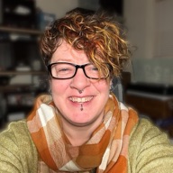
On October 14, I gave a lunch talk at StartingBlock Madison about checking a website for accessibility with free tools. Here’s the video, the slides, and the transcript.
The talk was billed as three ways to check a website, and while I was writing it, I added a fourth, so the room got a bonus.
All four checks run on Kettle & Crumb, a made-up coffee and catering site that I broke on purpose:
- an automated scan with the axe DevTools browser extension,
- a keyboard-only test,
- a screen reader (VoiceOver, which comes with every Mac and iPhone), and
- zooming the browser to 200 and 400 percent.
The scan found about half of what was wrong. The keyboard and the screen reader found the rest, and zoom found three more that I hadn’t counted.
Transcript
Do Your Part
So this is Do Your Part. After I sent it, I thought it sounds a little like Do Your Part, but it’s just Do Your Part. Three ways to check your website for accessibility. And I’m Bekee Gibson. But, because you guys are here with me, decided to add a fourth way while I was writing this weekend. So you get a bonus. Bonus check is in the future here.
So I just told you a little bit of this, but there I am. I was going to wear the same sweater and scarf, but I’m too warm. So I’ve been making websites since dial-up, which is my shtick. And while I was going to that graphic design school, I worked at the relay system for deaf and hard of hearing folks, and a woman that started working there also happened to be blind, her name is Karen, and she wasn’t able to read any of the paperwork. We had to go through a binder and find what script we needed to read, depending on what phone call came in, and she couldn’t read any of the memos or the newsletters, so I learned Braille so I could transcribe everything for her so that she could do her job.
Who has to make a website accessible
So she was able to read the newsletters and get the memos and what we’re doing this week or chili potlucks and all that stuff. And she also helped me with my Braille certification. She’s been on the Wisconsin Council of the Blind Board. She was the president treasurer for a while. So she’s been a pivotal relationship even back I was going to school. You might recognize me from the building maybe and we talked about this I used to work in the corner office over there and left at the beginning of September to do my 12 plus year LLC and that I had been doing on the side I’m doing that full-time now So that’s why I’m here so I want to teach and make the world accessible with starting with teaching people how to do it and I’m not a lawyer so I want to make sure that nobody takes anything I say as an interpretation of the law.
I’ve read the ADA Title II rule and I understand it but I’m not able to tell you what it means for your business so you’ll want to ask an actual lawyer if you’ve got questions about how any of the ADA rules affect your work. I know a person who might be able to help.
She’s sitting over here. But So today is just about what you can do check on your website or websites starting this week, even this afternoon, if you’re lucky. I do have some good news. Some businesses don’t need to make their sites accessible. Those are, So the Title III of the ADA covers businesses that are open to the public or places of public accommodation.
Two organizations that don’t fall under that are churches and private clubs. So if you run one of those sites, you’re not required by anybody to do that. Again, I’m not a lawyer. But if the church takes federal money, then it is required under Section 504. So it all gets very messy. The moral of the story is to just do the best you can and make sure that the sites are accessible because it’s nice. It’s nice to be nice, so any website that you are responsible for, can you run these checks on, regardless of whether they’re at a rave or at a church.
The alphabet soup
So this is, I’m cramming an entire other talk that I have into one slide, which is why I’m not going to get into all of the alphabet soup, this is our alphabet soup. So there’s national and international laws and regulations and standards, and they are a mess of letters and numbers. So the ADA has the Title II and the Title III, Section 504 if you receive federal money, Section 508 if you’re federal a agency.
WCAG, or the Web Content Accessibility Guidelines, is a set of standards that the W3C creates and maintains. W3C is the World Wide Web Consortium, and they keep updating WCAG for current use. Right now we’re on, I’ll get into the levels and the numbers right now, but they’re working on WCAG 3 which probably won’t come out based on the the timing of 2 in like 2040 or something so but there’s some really cool changes coming in WCAG 3. There’s also the European Accessibility Act and its standard which is its version of WCAG is the EN 301 549 which I know very little about but if you sell to folks in the EU, those standards apply to you as well.
When to start
And then there’s also, the AODA and ACA, are which the Ontario and Canada in general laws. So that was that. Once more, I’m not a lawyer in the soup. Isn’t that funny? I’m easily amused. So you’ve probably heard the adage that the best time to plant a tree was 30 years ago.
And the Americans with Disabilities Act passed in 1990. The first version of WCAG came out in ’99. So the best time to start thinking about website accessibility was also roughly 30 years ago. If you weren’t around then, or you didn’t have a website then, the second best time is now to start thinking about web accessibility.
Curb cuts
So some people might wonder, why do I need to do, why do I need to make my site accessible? There’s no blind people using my website, or people are able to be checking out and purchasing my things just fine. The reason is because it’s nice to be nice and because making your site accessible helps everyone, not just the person in the wheelchair. This this shows us that there’s no curb cut for wheelchair users, but everyone benefits from curb cuts. If you’re on a bike, you’ve got a stroller full of kids, you can’t lift your leg up because you’ve got a pinched nerve. These are all reasons that an ADA requirement has helped people who are not disabled in the general sense of the term.
Elevators were required for access to different floors and people who are not in a wheelchair or immobile are able to benefit from those things. And push plates to open doors are nice for people whose arms are full or if you don’t want to hold the door open because the person is too far away, you can push the push plate and then it will stay open for them.
So, a website without accessibility is like a curb without a cut, and everyone’s stuck not being able to get to your site. An interesting fact, if you need to convince someone to fund a project like this, more than one in four U.S. adults have some type of disability. So that’s 25% if you want to give those numbers to your finance director, that might encourage them to want to pay for an accessible website. So the one in four are interestingly, I thought, cognition and mobility are higher on the list in terms of the number of people with disabilities than vision and hearing.
And in my experience, people, when you say, like, accessibility for a website, the first thing you think of is a blind person. but when cognition and mobility are the top disabilities, that kind of makes this even more important, because it’s a disability that we can’t always see. So you don’t actually know if someone has a cognitive disability without knowing the person.
And then there’s temporary disabilities. Microsoft has an interesting categorization of permanent, temporary, and situational disabilities, and that’s how they work on their design schema, I guess. So temporary disabilities would be like a broken arm or a migraine and a situational disability would be like the bags or lugging your 16 kids around.
So how do you find out if your site has a curb with no cut? You check. So we can go on to our first check. Does anyone have any questions before I dig deeper?
Check 1: axe DevTools
The question was, can we get a copy of the slides? Absolutely. The slides are linked below this video. So the first tool to check with is axe DevTools. So this is a free browser extension for Chrome, Firefox, and Edge, it is by Deque Systems.
I’d say it’s the gold standard for automated testing. And it allows you to, it scans the page that you’re on and gives you the results of your pass against-fail the WCAG criteria that you choose. So let’s go over here. The mouse is a little choppy when it’s over the internet.
Go slow. OK. So this is our sample web page, Kettle & Crumb Coffee. So I’m going to activate the Chrome DevTools, which you don’t need to know how to do this right now, but just so I can show you the axe DevTools extension. So you can see there’s a bunch of stuff blocks on them. There is a paid version of this that does more, but you don’t need to pay for anything to do this test because the only button you can press right now is this scan full page, way over here.
So it’s gonna go through, oh don’t I want to do Wouldn’t be a demo if things didn’t work. So on this fairly simple page, it found six issues. I’m going to go over here on the left first and scroll down.
It categorizes them, so it found six total, one best practice. I’ll talk about that in a sec. And then the WCAG guidelines are in categories of critical, serious, moderate, minor. and I misspoke. Those are axe’s categories, not WCAG’s. We can see over here that best practices is turned on, so these are rules, they’re not guidelines from WCAG, but they’re things you should do, so I always leave it on. If I turn it off, you can see one of our issues goes away. I’ll tell you which one it is when we get over there. And then the standard for the Title II ruling is WCAG 2.1 AA, so the free version of this is stuck on that.
If you pay for it, you can change it to AAA, which is extra super great. Or you can change it to 2.2, which was released in 2023. But 2.1 has been around long enough that people, the DOJ didn’t choose 2.2 because it was too new at the time for the Title II ruling.
So most folks when they’re like, need we to be compliant to the 2.1 AA guidelines, you’ll be covered with this. So if we go over here on the right, oh, this is laggy. So we’ve got two issues with elements must meet minimum color contrast ratio threshold. So this wording here is from the WCAG guidelines, so it sounds a little formal.
If I enter into that, I can highlight the item. And behind this window, you can see the button is outlined. So the color contrast of the text and the button doesn’t meet the minimum. The minimum required for text at that size is 4.5 to 1, and this will tell us it’s 2.29. So either the text color needs to change or the orange needs to change or both to meet the expected contrast ratio.
And I’ll go down to images must have alternate text. So there’s one image on this page. It’s this coffee cup. And it needs alt text or an alt attribute. Otherwise, a screen reader is just going to say image and then go to the next element. And the person doesn’t know what it’s an image of.
And there’s a few guidelines, a few suggestions I would give to writing alt text, I usually say write it like you’re describing it to someone on the phone. But there’s also different ways of describing an image depending on the context of the content that you’re looking at. So, but basic guideline or suggestion is just describe it, pretend you’re describing it to someone on the phone.
And links must have discernible text. So the phone icon on the top right doesn’t say what it is. All a screen reader would hear is link. So it’s going to need something to describe what its purpose is. And select element must have an accessible name. So down in this request to quote form, this team size drop-down doesn’t say what it is to a screen reader, so there wouldn’t be, you wouldn’t know what question you’re trying to answer with this drop-down.
I lost my guy. And then the best practice is this level one heading. It’s missing. So there’s no H1 on the page. So there’s nothing to tell the user what the page is about. Typically for search engine optimization and screen readers you would have Kettle & Crumb home page or some folks use better coffee for your whole office would be the h1. So this page doesn’t have any of that.
All righty. So now we’ll look at a fixed version of the page with the axe DevTools. So we re-scan. Zero automatic issues, nice. Yay, your work’s done. So you may notice, let me get this out of the way, the button color got a little darker and I’m just going to show you the things that you can visibly see that are different.
The form now has a different way of indicating a requirement. The team size is the label for this drop-down and the submit button also the same orange. It was it was the lighter orange before. So that’s what the free scanning tool found.
Any questions about that before I go on?
The question was, what do you do when you get to the end of a project and none of the colors in the design style guide pass? Then you have to go back and negotiate a change with the brand owner or the designer.
Yeah, there’s a, I actually just built a site with orange. So I built a site and then did a scan and I was like, oh, I can’t use their brand colors, even though I looked to my eye like it was fine. So I had to negotiate with them a slightly darker orange for certain elements, and then switch to a completely different brand color for other ones, but they were nice about it, but that’s a rarity.
Check 2: Keyboard
Good point. Let’s see. We’re going to see these pages again a couple more times. All right. So now we’re going to check the page with a keyboard because our friend’s right arm is broken. I’m going to try to get my mouse back over here again.
Another user of this system would be a switch user. So this machine connects to a computer like an external keyboard. That person can program the buttons to do anything, but it’s essentially for someone with limited mobility to go forward and backward in a site. So typically it’s one button is a tab key, so they can tab through, which is the method we’re gonna see here. The other one is shift tab, which walks you backwards through your tab tree. And then the big key in the middle is enter. So that would be to activate the thing.
The question was, do people with disabilities actually use a switch like this to get around websites? Yeah, so someone maybe that is in a wheelchair and can’t move anything but their neck. They might navigate with their cheek. Or, you know, this cheek goes backwards.
And some people use what’s called a sip and puff. So you have a straw and you blow to go forward and you sip to go backward. Yeah, so it’s amazing. Good question. Thank you. All right, if I can get this to go.
OK, so this illustration of our Kettle & Crumb site is showing all of the active links on the page that a keyboard could tab through. So a keyboard doesn’t go through text that you can read. It only goes through the things that are active links are available to click on if you had a mouse. So this is just showing what the page would look like to a keyboard as the broken version of the of the page.
So let me go there. And then so now I’m going to try not to use my right hand, which is the one I use for my trackpad. And so I’m tabbing. You can’t see it, so give me one sec.
Alright, this is an app I have that lets you see what key I’m pressing so that in this demo, hopefully, it’ll help. Okay, so the arrow with the line is a tab, so I’m tabbing through the site four times. I don’t know where I am. I can’t see anything, so I’m just going to give it a go and press enter.
I don’t know how, I don’t know what’s going on because I can’t see where my cursor is and now I just tabbed again and now the cursor is in the name box. Okay, so I’m here. That’s great. I’m still not sure what I’m doing as a user of this site, but I probably want to tell them that this is happening.
So I’m going to fill out this form, and it’s not selecting team size, but it’s not relevant to what I’m doing. So I tabbed out of the text box, and now in the series of events, I should be on the submit button but it’s so I’m gonna hit enter because that’s what you would do to enter the form and it opened the privacy policy what what the hell’s going on here so you can see the link down at the bottom it’s skipped past the submit button so now I’m mad and I’m gonna go get coffee somewhere else so I’m gonna close this guy and show you what it should actually look like to a keyboard user.
All right, so tab. So there’s a skip to main content link at the top, which allows a keyboard user to skip past a menu. Some sites have navs of like 10, 15 drop-downs. And so this skip to main content lets me skip past that, but I’m going to keep walking through. So there’s an outline around each link that I can choose, which tells me where I am on the page, which is a focus indicator. So now I can see, oh, great. I don’t hate this place so much. I can enter my name and submit. So that’s the difference between good and terrible. All righty. Any?
The question was, does axe show you the tab order? I think with the paid version you can, but I haven’t paid for it in a long time, so I’m not sure.
To finish that answer, yes. The paid version, axe DevTools Pro, has a keyboard test that tabs through the page for you and shows every stop in order. If you want a free option, Firefox has one built in. Open the developer tools, go to the accessibility tab, and check show tabbing order. Where’s my thing?
Alrighty. Please grab food. Alright. Aww, this lady. So… Get my mouse back. Alright, so do you remember Karen from the relay system? This is her. So she’s going to order some coffee for her office meeting, and she uses a screen reader.
She also sometimes uses what’s called a refreshable Braille display. So this is like the switch device, this is just an extension, external keyboard, and it has little pins that poke up and down that create Braille letters. So she can read over here, she can Braille with it, and then she can type on the keyboard. So usually it sits between the user and the keyboard.
It’s useful for like reading the spelling of something on the screen, or if you fill in a form field and you wanna make sure that you spelled your email address right, you would check that. So not unlike sighted users, Karen does not read every word on your website, much to the chagrin of copywriters everywhere.
Check 3: Screen reader
So screen readers, instead of reading everything to you, they group content together like headings on the page. So in a well-formed website, there’s a heading one, and there’s a couple heading twos, maybe some heading threes that help a person decide, is that section relevant to me? Do I wanna read more about it? because they’re not going to read the entire page from top to bottom to decide if it’s useful for them.
There’s also lists of links, like we saw with the keyboard. So all of those links would be listed. So I can decide whether or not I want to click here or read the privacy policy. So let us go. So, I’m going to use, in a sec, Mac’s version of a screen reader, which is VoiceOver. It comes with Mac and iPhone.
It’s the least popular of the screen readers, because most folks use Windows machines, and there’s JAWS and NVDA are the top used screen readers, but this is the one I have access to. And And they all do things a little differently, like even the Mac versus the iPhone.
The results are different, which is why you’ve got to test on all of them. So before I turn VoiceOver on, though, because it can get a little, it makes me nutty. And I’m just going to make up that it happens to other people too. Just want to show you what the screen reader would see in terms of headings on this page. So we already saw in the axe best practices that it’s missing one, it’s missing an H1. So there was also no more on the page. So this doesn’t help anybody because the screen reader can’t get or can’t make a decision to go. And then the links that I could get to are Kettle & Crumb.
So this is a little more information, about, contact, and then link, whatever that is. Request a quote, click here, click here, click here. Privacy policy. So you can see that some useful, some not. We’ll figure out how we can maneuver through this together. All right, so I’m gonna try not to talk over VoiceOver.
And if you wanna move up to hear it, can. you tried to turn up the TV, then but it changed to light. So it’ll be OK if we all just listen quietly. All right. So I’m going to turn on VoiceOver and then turn on what’s called the Rotor, which is what lets you scan through the headings, the links, the landmarks to figure out where you are on the page.
You are currently on web content. To enter the web area, press control, option, shift, down arrow. Most screen reader users listen to this at like 90% speed. So this is at 50. So most blind folks, their hearing is way better than ours because they have to make up for the lost sense.
Two quick corrections. First, the 90 and 50 are VoiceOver’s speech rate setting on a scale from 0 to 100. They aren’t percentages of normal speed. Second, blind people don’t hear better in general. What research does show is that many get very good at processing what they hear, like following speech that’s much faster than most of us could keep up with. But I turned this down so that we could all hear it. So I’m going to start tabbing through and we can listen to what Samantha is the name of the voice. We can listen to what she says.
So I’ve jumped there. I’m not sure how that happened. Click here. You are currently on a link. Click here. You are currently on a link. To click this link, press Control, Option, Space. So like, what does click here mean in context? Like, I don’t know. I can’t read the page. So I don’t know what else is on there. Let me get down here. You are currently on a text field. To enter text in this field, type. Email, email, blank. You are currently on a text field. To enter text in this field, type.
So you may or may not have noticed that there is some sort of an indicator that those two fields could be required potentially. But the screen reader didn’t know that. There’s nothing to tell it that. So I don’t know that I have to enter something there to submit this form.
think I got everything. It’s very hard for me to use screen reader because it’s like, just I want it to work. So I’m going to turn it off for a sec, and then close that, so this is the corrected version.
It keeps putting it on the wrong screen. I’m just going to go over to the phone. So now we know what that link is. Thanks for sitting through that with me. And then, so now the links are more descriptive. So I know what I’m doing down here.
So, it says, required, and then, so it doesn’t, doesn’t it doesn’t, it doesn’t, it doesn’t, it It may not seem like that was better, but it was. There’s more. It said more stuff, there’s so more to talk about, so that’s good.
Oh boy. Where’d you go?
The question was, I can’t imagine having to train yourself to use a screen reader and then being so frustrated when people don’t build sites well. What do you do? Well, Karen, she’s been, she’s you know, let me start over. Apple has a team of sight impaired or people who can’t see and they work closely on the iPhone operating system to make stuff work better but they’re constantly updating how it works. Karen was like I can’t learn a new thing every time you just decide to do something so she switched to the phone that blind people use, because she’s not dealing with the iOS updates every two days.
It’s like, I can’t do it. So, even companies that are doing great are pissing people off. I mean, it’s just focus group of one, but that’s worth it.
The question was, when I say ghost text, do I mean placeholder text? And then, will HTML ever let screen readers read placeholder text? So, the HTML, screen readers use HTML as an API to decide what to say. And placeholder text is not on that list.
The follow-up was, if screen readers start reading placeholder text someday, and you’ve already added a label, won’t it get read twice? How do you balance that? I guess, I mean, I wouldn’t be able to answer. We’d have to do HTML6, probably, to get that.
A correction on placeholder text. Most screen readers do read it, because browsers use it as a fallback name when a field has no label. The problem is that it disappears as soon as someone starts typing, and it’s often too light to read, so a real label is still the fix. And to answer the follow-up, and to answer the follow-up, when a field has a real label, the label is its name, and the placeholder is only the backup.
Some screen readers read the placeholder after the label too, so don’t repeat the label in the placeholder. So the reason, or the… I have, I haven’t. Um, it isn’t, my unofficial opinion is that I don’t think anyone’s gonna make HTML better for screen readers.
I don’t, I don’t think, like that’s not that group’s, the group that decides how to do HTML. I don’t think that’s their highest priority. Um, that could change, that would be great if we didn’t have to use ARIA role for everything and you know if that wasn’t necessary then there would then it would be easier to make things accessible yeah I mean, there’s probably a group of people fighting for that.
Someone suggested using a label and hiding it visually yeah and that’s a good point because there’s there’s usually more than two ways to solve a problem and you just get to decide which one is the best for you and your users. Excellent question.
Any other questions about the screen reader? No. I’m excited to. There’s a company called Assistive Tech that you can. I’m not buying a Windows machine. So I can pay them a subscription to get access to JAWS and NVDA. So I’m excited to try that, see if it’s more or less annoying. I doubt it.
Check 4 (bonus): Zoom
All right. Bonus time. This guy, this guy gets me. All right. So, the zoom test is for anyone who needs text bigger, so low vision, older eyes, reading glasses on your head that you can’t find. No tool is needed for this except a browser, and axe doesn’t find these, so this is a good test if you don’t want to deal with VoiceOver. Use this and axe and you’ll be good. So let’s do demo. Alright, so I’m going to zoom in to 200%. So this is a way to test a couple of WCAGs. I can’t remember all of them. There’s like 78 of them and I can’t.
I’ll get them someday, but I don’t remember which one it is, but you want to test for things getting hidden content being obscured. And we can see here that someone with low vision, Karen’s husband, could only see out of a very small area of one of his eyes. So he would magnify his screen, and he’d be about this close to his monitor. So you could only see four inches around a screen. We’ll get to what that looks like. But this is an example of a user that would need to zoom in to see content. And they’re missing what happens on November 20. I don’t know what’s on there.
And then if I find my mouse and click Contact, The form is obscured by the nav, so that’s another, that’s a bug to remedy. Tab, maybe? Maybe not. So, broken. And then the next one to check and fix is 400%.
So, roughly this gives you a preview of what it might look like on a small phone, and we can see, aside from the fact that your phone would change to a mobile menu, but we can see the announcement is different now, but it scrolls off the screen, so no horizontal scrolling is fixed.
making sure you don’t have horizontal scrolling is a success criteria. So this will help you test to see if any form fields, some people like to put widths on their text areas, and if those stick off the screen, then that’s going to fail on this criteria.
So if we go to fixed, I’m sure I’m talking a lot. I’m going to try to speed up for you, so that we have time for questions. So this is the fixed at 400. You can see the announcement bar is readable. We’ll go back down to 2.
And the nav is good. And I click Contact. And now I can get to the form. Awesome. Any questions about zoom?
The question was, how do I fix zoom problems fast on Squarespace? Yeah, so that’s probably going to involve some CSS or HTML changes to like overflows or the width of the containing. It might not let you break. It might not let you do this at all. Like it might not let you produce something that is broken in this way. I can’t remember if Squarespace has like a CSS override area or somewhere that you can make it conform. to To answer that, yes, Squarespace has a custom CSS panel on every plan, so that’s where a fix like this would go.
The question was, is there a minimum page width and what width does the zoom test use?
What each check found
To give you the exact number, the test width is 320 CSS pixels. That’s WCAG success criterion 1.4.10, Reflow. At 320 pixels wide, the page should still work without scrolling sideways. Alright, any other questions? I’m going to zip. Here we go. So we found about half of the issues on a simple page with the axe tool. So that’s pretty good. I mean it’s a D but it’s okay.
The keyboard and the screen reader found, let’s see, four more, five more. So we found the submit button wasn’t accessible at all. I skipped over the the services menu you couldn’t even get to with the keyboard and then the screen reader found all those other issues that we heard about and then zoom found the bonus that announcement bar was was not accurate.
Keeping it accessible
So after you’ve used one or more of these methods to identify and remediate your issues then that just gets more people closer to using your site. So we checked all of these on an existing website but just like there’s no better time to start learning accessibility 30 years ago, starting to think about accessibility in a project is it begins at the brand. It doesn’t begin a week before launch, please.
So Kettle & Crumb, you know, went with this yellow orange because it evoked an emotion that the brand director wanted and, you know, we decided, okay, we’ll go with it. We printed packaging and got billboards and cup lids and all this stuff and now we know that it’s hard to read and it doesn’t pass contrast. So somebody is going to be mad about that, because we have to rebrand or pick a different color.
So considering that at the beginning could be less expensive for everyone. The one thing I like to remind people, an audit or remediation is not it’s not like a home inspection. You don’t do it once and then leave it alone for five years. It’s like mowing the lawn, where you have to do it often. Content on your site changes. You’ve got four or five people writing alt attributes for images.
If someone leaves, a new person comes. They don’t know what they’re doing and that’s fine because they’re new. You need training or an SOP. So there’s a continuous improvement situation. So having a system in place, even if it’s I’m going to run axe once a quarter on two pages, that’s better than not doing it at all.
Audits and remediation
And every site that passes every WCAG check, won’t work for everyone, because what helps one person might make it harder for someone else. One example is that if someone, if you want to use super high contrast to pass the contrast, like, it’s 13 to 1, then that might mean that someone that gets migraines or that is autistic has a hard time using your site. So you can’t please all people at all times. So just try to middle road it to help as many people as possible. Well, if this seems like a lot, or you don’t know how to fix your Squarespace site, I know a guy.
So I do audits and remediation if it’s a platform that I can get access to. So, take a card, find me on LinkedIn or my site. Thank you guys.
I edited the recording. Where I got a fact wrong in the room, the video pauses and I give the right answer in a voiceover. I also cut the audience voices and restated each question myself.
The slides are here: Do Your Part slides (PDF, 18 pages, 4.9 MB).
After the talk
A few more questions came in after I wrapped up. We were too far away from the microphone by then to clean up the audio, so here they are in writing.
Are Lighthouse’s accessibility results comparable to axe? I hadn’t used Lighthouse’s accessibility results, and in the room I guessed they’d turn up about the same problems. They do: Lighthouse runs a subset of axe-core’s rules, the same engine behind axe DevTools. My advice is the same as for page speed tools. Pick one and stick with it. When people compare PageSpeed Insights with GTmetrix, they start trying to fix the tools’ problems instead of their own.
For project managers who don’t code. Deque, the company behind axe, has accessibility courses for project managers. They cover the part of the work that isn’t code, like catching a problem early so it doesn’t land on the developer the week before launch.
Alt text helps search, too. The same alt text a screen reader reads also helps search engine bots and answer engines understand an image.
See where your site stands
The axe scan in the video checks one page at a time. My free Site Health Scan checks up to 20 pages for accessibility (WCAG 2.1 AA) and technical SEO, and the full report comes by email. It’s automated, like axe, so it finds about the same half; the keyboard and the screen reader are still yours to run. Run the free scan.