
A free accessibility scan will hand you a list of items it says need manual review. That list is not a failure and it is not a to-do list. It is the scanner being honest about the part it cannot do.
The scan told you the truth.
Run a free accessibility checker against your site and you get three kinds of result. Some items pass. Some items fail, with a specific reason and usually a specific fix. And then there is a third pile, often the biggest one, that says something like “230 elements need manual review.”
Most people read that third pile as a list of mistakes. It is a list of places where the scanner looked, understood exactly what it was being asked, and declined to guess.
A scanner checks color contrast by comparing two colors, the color of your text and the color behind your text. It reads both out of the stylesheet, does the arithmetic, and tells you whether the difference is big enough for someone with low vision to separate the letters from the background. That works when the background is a color.
It stops working the moment the background is a photograph, a gradient, an illustration, or a video. Now there is no second color to compare against, only a picture made of thousands of them. The scanner cannot see pixels. It reads the stylesheet, and the stylesheet says background-image, which is not a number.
At that point the scanner has two choices. It can invent a number, or it can tell you it doesn’t know. The free ones tell you they don’t know, and I would trust one that guessed a lot less.
What the scan cannot tell you, using my own mistake.
The brand colors for a client site came out of a photo she sent me, her hand holding the paint chips she had picked for the walls, everything behind them out of focus. I eyedropped the orange off that photo, built the palette in WordPress, and made it the primary color.
That orange was never exactly the chip’s color. It was paint, under the light in her room, photographed by a phone that made its own decisions about white balance, flattened into sRGB before it reached my screen. Three transformations before I ever looked at it, and I still trusted my eye on the result.
Then I looked at the headings set in that orange, on a page with a faint gray line drawing behind them, and I decided they were fine. I write accessibility audits for a living. My own tool measures exactly this.
I looked at it and I believed it passed.
It missed by 0.24.
Contrast is measured as a ratio, and large text has to clear 3:1. That heading measures 2.76:1 against the drawing behind it. The gap between passing and failing is 0.24 of a ratio point, and no eye resolves 0.24. Not yours. Not the eye that picked the color, which was mine.

#E57200, the color I chose: 2.76:1 against the gray. Fail.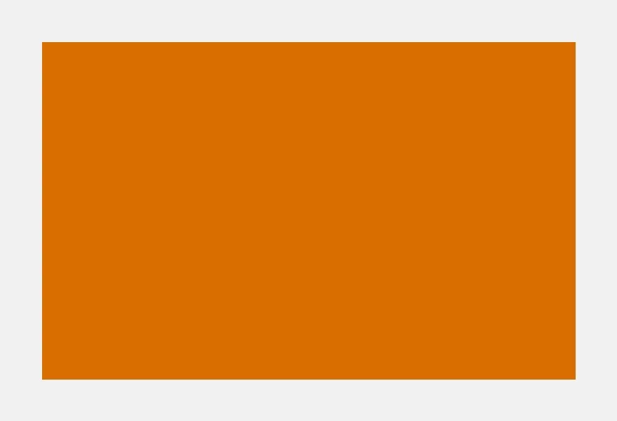
#DA6D00, the nearest color that clears the bar: 3.01:1. Pass.One of those oranges fails and one passes. Side by side I can see they are not the same color. What I cannot see is which one fails: nothing about the brighter one looks like a problem, and no amount of staring turns a 0.24 gap into something an eye can rule on.
The fix is not “make it darker.”
The obvious repair is to darken the orange until it passes. I tried it. The color that clears the bar is different enough to see when the two sit side by side, which is what the picture above shows, and it clears the bar by nothing at all; one slightly darker line in that illustration and it fails again. Push the color far enough to be safe and you no longer have orange. You have brown.
Orange is a bright color that reads as a bold one. It is saturated, which the eye interprets as strength, and it is light, which is what the math measures. That combination is why orange fools people, and it is why the fix on that heading turned out to be a design decision rather than a color value. Somebody has to decide what changes: the drawing behind the letters, or the letters.
There are two honest fixes, and the math accepts both. Fade the drawing until the orange clears the bar, or leave the drawing alone and give the letters a hairline outline in a darker shade, a line too thin to read as its own color. The tiebreaker is not in the stylesheet. The owner picked that drawing because she wants people to see it, and fading it far enough to pass makes it harder to see. Being seen is the whole reason it is there. So the fix I would make changes the letters, by an amount nobody will likely notice. The numbers tell you what passes. They cannot make the design decision for you.
Where that leaves your 230.
The scanner did its job. It caught what could be caught by reading a stylesheet, it refused to manufacture the rest, and it handed you the part that needs a person to look at real pixels on a real page at a real screen width.
That pile is not your fault. It is also not nothing, and it is not something you can clear by squinting at your own site, because you are the person least able to see what is wrong with it. You chose those colors. They look right to you. They looked right to me, and measuring them is the only reason I know better.
If you want somebody to work through that list and tell you which items are real, which ones are the scanner being cautious, and what each one costs to fix, that is what an accessibility audit is.
And if you would rather see the measurement itself, down to the pixels behind the letters and the bug I found in my own scanner while writing about it, that post is here.