Every automated accessibility scanner gives up at the same place, and it gives up for a good reason. I built the part that doesn’t give up, got it wrong, shipped a number I could not stand behind, and found out because a heading on a site I built failed by an amount no eye can see.
The pile.
Run axe, WAVE, or Lighthouse against a page where text sits on a photograph and you get the same result from all three. The element goes into a list of items needing manual review. Nobody gets a number.
The reason is not laziness. Those tools read the computed CSS, which is the only source of truth they have. They see color: #FFFFFF. They look for a background-color on the element, find nothing, walk up the ancestors, and find background-image: url(hero.jpg). There is no second color to compare against, because the second color is four hundred thousand different colors arranged in the shape of a photograph. A tool that cannot see pixels has two options at that point, and guessing is the dishonest one.
I like that they decline. Declining to guess is not the tool giving up; it is the tool refusing to hand you a number it cannot stand behind. What it leaves behind is a pile, and on one page of a client site the pile was 230 elements deep.
So I measured them.
Taking the measurement is only a few screenshots, and I am going to walk through them plainly. The part worth your attention is not how the measurement works, it is knowing whether to trust the number it hands back.
The scanner screenshots the element as the browser composited it, photograph and gradients and blend modes and all. Then it hides the letters with a global transparency rule and screenshots the same region again, which gives the true background where the text was sitting. Comparing the two is enough to know what is behind the words.
Knowing exactly where the words are is the harder half. It repaints the element’s glyphs in a magenta that appears nowhere else on the page, screenshots a third time, and uses that sentinel color as a mask. Every pixel that came back magenta is a pixel a letter was covering. It samples the real background at those coordinates and nowhere else.




That turns 230 elements of manual review into 230 pass-or-fail measurements. The pile every other scanner declines to guess at becomes a number.
Why the mask, and not the whole box.
The obvious way to read the background is to sample the whole element box. It sounds right, and it is exactly what the glyph mask exists to avoid.
An element box holds more than the background behind the letters. It holds the padding. It holds the icon next to the word. It holds a decorative underline a few pixels below it. Sample the whole box and you fold all of it into the measurement, including pixels no reader ever looks through to read the text.
Take the word “menus” in a site’s navigation, dark green on white. axe will not even grade it: a dropdown caret shares the word’s box, and where the caret sits, axe cannot prove what is behind the letters. So it declines to guess and drops the word in the needs-review pile. The glyph mask measures only the pixels the letters actually cover, which are white, and returns 7.41:1, a clean pass. Sampling the whole box would have folded in the caret and the underline and reported something worse, for a reader who is looking through neither.
The mask is the difference between measuring what the reader sees and measuring the neighborhood around it. It is not more lenient; it is stricter about what counts as background. It turns a stack of needs-review maybes into clean passes, and every genuine failure survives, including the one I care about most.
The failure that survived.
The orange heading over the illustration fails at 2.76:1, and no honest measurement rescues it. It is large text, so its bar is 3:1 rather than 4.5:1, and it misses by 0.24.
Behind the letters is a faint gray line drawing, a watermark, nothing anyone would call a background. Its darkest lines sit around rgb(241,241,241). On a phone the illustration is not behind the heading at all, so the same orange lands on white, measures 3.12:1, and clears the bar. The scan reports the desktop failure and names the breakpoint, because a finding that does not tell you where it fails is not finished.


I chose that orange, I built the palette, and I looked at the heading and believed it would pass. It missed by 0.24 of a ratio point, which is not a quantity any eye can resolve. The longer version of that story, and what it cost, is in what a free scan can and can’t tell you.
Orange lives in the dead zone.
Relative luminance is a weighted sum of the three channels, and green carries the most weight, 0.7152. You would think that makes orange a green story. It does not. #E57200 is red 229, green 114, blue 0, and it is the red that does the most work here, despite its lighter weight, putting the color at a luminance of 0.287. That is a bright color pretending to be a bold one. Saturation reads as strength to the eye, and the contrast formula does not care about saturation at all.
Against a gray background, that orange clears 3:1 on 76 of the 256 grays. It passes on rgb(251) and lighter, five values. It passes on rgb(70) and darker. It fails on every gray from rgb(71) through rgb(250), a dead zone 180 values wide.
So orange sits to the left of the middle of the brightness range. It needs a background that is nearly white, or nearly black. The watermark at rgb(241) is not a dark background; it is ten steps into a dead zone that starts just under white.

#E57200, sits at 0.287, about as bright as a mid gray. It clears the 3:1 contrast bar only against near-black backgrounds (rgb 70 and darker) or near-white ones (rgb 251 and lighter); across the whole middle, roughly rgb 71 through 250, it fails, which is why the strip shows green checks (clears 3:1) at the two narrow ends and red crosses (fails) across everything between. The watermark gray, rgb 241, sits at 0.88, deep inside the fail zone, and measures 2.76:1. White, at 1.0, passes by a hair at 3.12:1. The passing band near white is only about 4% of the scale, and the watermark misses it.Two remedies, one of them brown.
The obvious move is to darken the orange a little. The obvious move does not survive contact with the math.
To clear 3:1 against that watermark the color has to go to #DA6D00, which lands at 3.01:1 with no margin at all; one shade darker in the illustration and it fails again. #DA6D00 is 4.0 ΔE away from #E57200, which is not a nudge, it is a color the client would notice next to the paint chip it came from. And if that orange ever has to carry normal-size text at 4.5:1, the color that passes is #BA5D00, 15.8 ΔE away, which is brown. You cannot darken orange without it going brown, because orange is saturated and bright at once, and contrast only buys you the bright half.
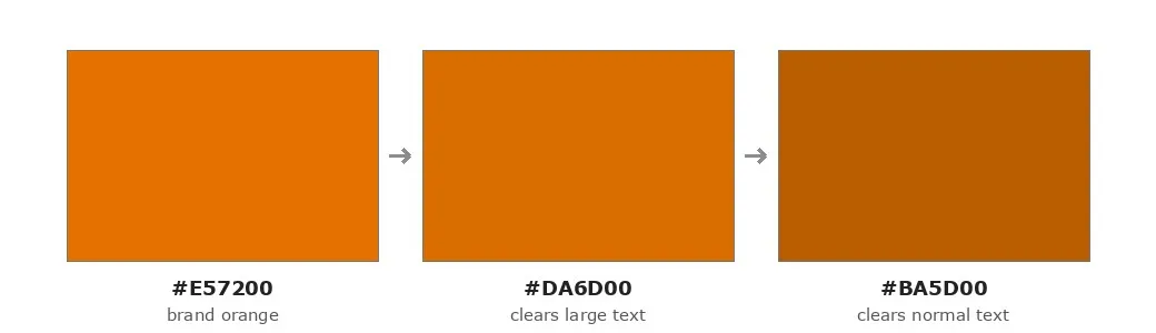
#E57200 (brand orange) fails the heading at 2.76:1. #DA6D00 clears the 3:1 large-text bar, but only at 3.01:1 and already a 4.0 ΔE shift the eye catches. #BA5D00 clears the 4.5:1 normal-text bar, 15.8 ΔE away, and is unmistakably brown.The fix I would make is a stroke on the heading, in #BA5D00, the same brown I just ruled out as a fill. Useless as a fill, it is exactly right as a hairline: a 1px line too thin to read as brown, dark enough to carry a passing contrast, and the letters keep their orange. The reason it works is the same reason the scanners decline to guess. My tool does not hard-fail text carrying a solid stroke, because a stroke carries contrast the fill-versus-background measurement cannot see. The finding does not get hidden. It gets retired, by a tool that knows the limit of what it measured.

#BA5D00 stroke around the letters. The hairline carries known-passing contrast without changing the orange the reader sees.The pixel it picked was the wrong pixel.
The mask was right. The pixel it picked out of the mask was wrong, and I did not catch it until I sat down to write this post and went back to double-check a number I was about to publish.
The function that does the measuring is measureGlyphMaskContrast, and the comment at the top of it states the goal plainly: find the background pixel that contrasts least with the text, because that is the pixel that decides whether someone can read the word. When I read the code under that comment, it was doing something else. It collected the luminance of every background pixel under the glyphs and picked one of them by percentile, and the direction it picked was set by a flag called textIsLight (just textLum >= 0.5). Light text took the 95th-percentile brightest pixel. Dark text took the 5th-percentile darkest.
That is not the pixel the comment describes. WCAG contrast is (Lhi + 0.05) / (Llo + 0.05), and the ratio slides toward 1.0 as a background pixel gets closer to the text in luminance, not further. The pixel that contrasts least is the one nearest the text from either side, so the darkest and lightest pixels behind the letters are the two with the most contrast, not the least. The code was reaching for an extreme, landing on the safest pixel under the mask, and reporting it as the worst one. The comment and the code had been contradicting each other the whole time, and I had never caught it because it had never once mattered.
It had never mattered because the one heading I built the feature for passed anyway, by luck. The watermark behind that orange runs 241 to 255, every pixel lighter than the text, so the nearest pixel and the darkest pixel are the same pixel and the answer comes out right by accident. The luck runs out the moment the background straddles the text, which is the whole reason a photograph is hard.
I ran the numbers myself to be sure. Put that orange over a background that is half shadow at rgb(12,14,20), a third midtone at rgb(120,105,85), and a fifth highlight at rgb(210,205,195). Hunting for the darkest pixel lands on the shadow and reports 6.19:1, a clean pass, while a third of the letters sit on the midtone at 1.71:1, invisible. Checking both ends, which is the fix most people reach for first, reports 1.97:1: it flags a failure, for the wrong pixel, with the wrong number.
The fix I landed on removes the branch instead of extending it. The scanner now computes the contrast ratio for every masked pixel, sorts the ratios, and takes the 5th percentile of the ratios rather than of the luminances. One rogue pixel still cannot swing a verdict, there is no direction left to guess at, and the textIsLight flag has nothing left to decide.
What bothers me about the error, and the reason I am telling you about it at all, is its direction. It could only ever produce a false pass, never a false failure. On photographic backgrounds, the exact case the feature exists to handle, my scanner was quietly generous, and generous is the one direction an accessibility tool is not allowed to be wrong in. I reran the page after the fix and got 230 measured, 203 passing, 23 failing, 4 undecided, identical to the day before, because none of that site’s backgrounds straddle their text. The bug was invisible on the site that made me build the feature.
Why those are the right pixels.
As contrast drops for someone with low vision, the faint edges of the letters go first. The anti-aliased outline dissolves and what is left is roughly the solid core of each stroke. Whether that reader can make out the core depends on what is directly behind it. Not the padding, not the underline, not the icon beside it.
You could object that nobody ever sees the pixels behind a letter, because the letter is covering them. At the scale of a stroke the objection dissolves: the ground directly behind a stroke and the ground touching its edge are the same pixels, and the mask is how the tool reads the background exactly where the reading happens.
That region is what the mask samples. The method matches what the reader is trying to resolve instead of averaging in decoration nobody is looking at.
What an audit is.
Anyone can wrap axe-core. It is free, it is good, and it is a few lines of code. What you cannot download is the decision about whether the number it hands back is measuring what you think it is, and that decision took a nav word axe would not grade because a caret shared its box, a heading I colored myself and misjudged, and a percentile that pointed at the safest pixel on the screen and called it the worst.
That is what an audit is, and it is not the scan. It is the reading of it, by somebody who will tell you when the scan was wrong.
If you got here from a free scan that handed you a few hundred elements and told you to look at them yourself, the post you want is what a free scan can and can’t tell you, which has no pixels in it at all.