An accessible site that still looks like Marigold
Marigold Kitchen is a breakfast and brunch spot with a busy catering side, and I built their website. It launched looking the way we all wanted it to. I wanted to be sure the finished site worked for everyone, so I ran it through a full accessibility check, and a few of my own choices didn’t hold up the way I’d expected. The biggest one was a color call: I’d used Marigold’s brand orange for small text because I was confident it would read well, and it didn’t, not for everyone. So I went back and made the site work for the people it was leaving out, without losing the look that makes it Marigold.
What the check turned up
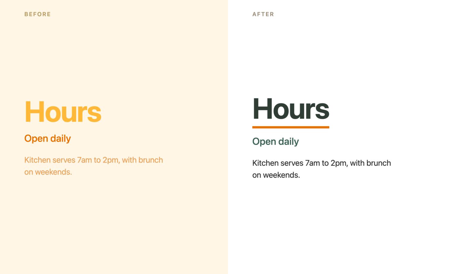
The scan flagged 63 spots where text didn’t stand out enough from its background to read comfortably. Most of it traced back to how I’d used the brand colors: the bright marigold yellow as heading text, the orange for small copy. Both are great colors. Neither one reads well at small sizes on a light background, and several of those spots were a struggle for anyone without sharp eyesight.
The contrast was the part you could see. The rest you couldn’t:
- The theme wasn’t outputting a main heading on any page, so someone using a screen reader had no fast way to tell what page they’d landed on.
- The logo links back to the homepage, but it had no text behind it, so a screen reader couldn’t say what it was or where it led. The small catering logo in the footer had the same gap.
- A few other links didn’t say where they led, the kind that make sense when you can see the page around them and go quiet when you’re tabbing through links on their own.
- The catering pages used marketing lines as their headings (“Gatherings come in all shapes and sizes…”). Those read beautifully on screen and told a screen reader nothing about what the section actually was.
What got better
The fix was never to strip the brand out. Marigold’s colors are the whole point, and I wanted them to stay. So I gave them jobs they’re good at. The orange moved to button fills, link underlines, and the “you are here” marker in the menu, all places where a color can carry weight without being something you have to read word by word. Body text and links became a dark ink and a deep green that hold up at any size. The yellow stayed as an accent. A regular visitor won’t notice a single change; the site still reads as Marigold.
Then the invisible work, the part that matters for people who can’t rely on the visuals:
- Every page now has a clear main heading.
- The logo and the other links say what they are and where they lead.
- On the catering pages, the marketing lines stay exactly where they sat on screen, and invisibly supporting each one is a plain descriptive heading that only a screen reader picks up. The page makes sense whether you’re reading it or hearing it.
- I added a sitemap page (the human-readable kind, not the one search engines use), so there’s a second, simple way to reach anything on the site.
The 63 hard-to-read spots came down to 2. Missing link labels, empty headings, and pages without a main heading all went to zero. Both of those last fixes keep working on their own, too: any page Marigold adds later gets its main heading automatically, and the sitemap picks up new pages as they go up.
The honest part
A few things I left alone on purpose, and that matters as much as the fixes.
- The Instagram feed pulls its captions straight from Instagram, so the image descriptions are whatever the caption happens to be. I can’t hand-write those without breaking the live feed, so it stays as is.
- The date picker on the catering inquiry form is a third-party calendar tool that already labels itself correctly under the hood.
- One band on the menu page, the breakfast photo with text over it, sits just under the contrast target. It’s still readable, and the only way to push it over the line was to change the food photo, which wasn’t worth losing a good photo over.
None of those are hidden. They’re written down, so Marigold knows exactly where the site stands and why.
Where it landed
The people who already loved the site won’t notice a thing. The people it was turning away, anyone with aging eyes, anyone squinting at a phone in bright sun, anyone using a screen reader to order breakfast or plan an event, can use it now. That was the whole point.