/scan/next-steps/
Needs manual review (1)
Color use (SC 1.4.1)
1 form on this page Manual review
Submit the form with required fields left blank and confirm that required fields and any error states are indicated by more than color (asterisk, icon, label text, border thickness). Any color cue used must also meet contrast and must never be the only signal.
Keyboard and focus order (32 stops)
The links list, as a screen reader user gets it
| Links | All announce as |
|---|---|
| 3 | bekee gibson |
| 2 | Say hello: contact page |
Heading outline, as announced
- Would you rather hand it off?
What this looks like on the page
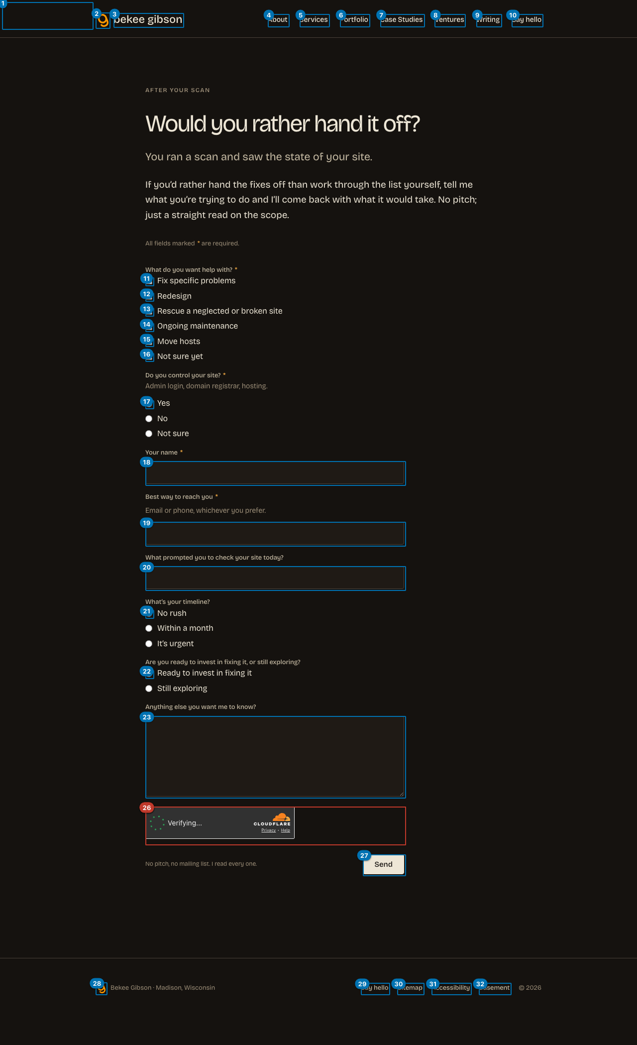
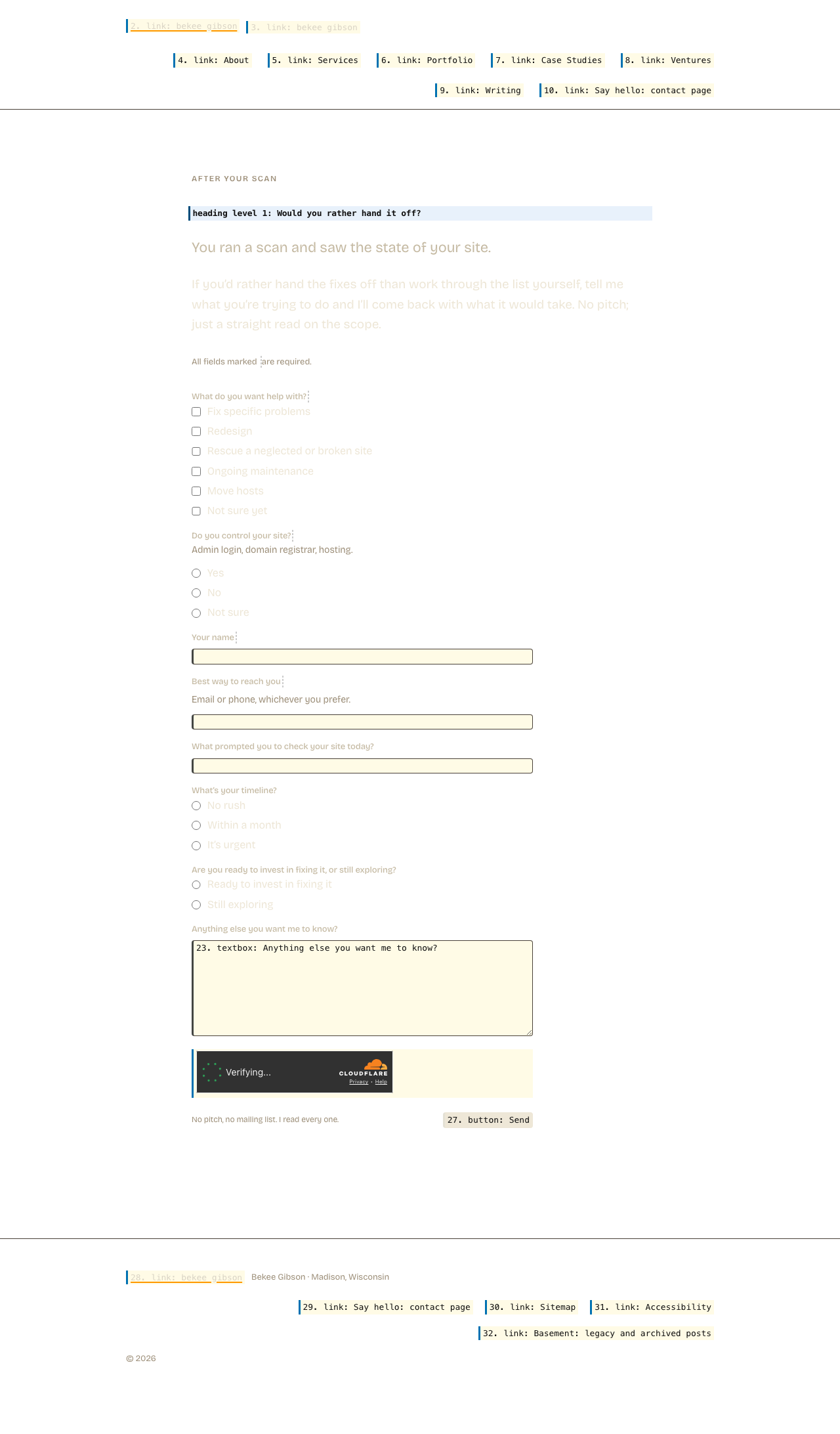
AI-assisted findings (needs human confirmation)
moderate Heading: Would you rather hand it off?
The sole h1 on the page is phrased as a question that presupposes context the visitor may not have. On its own it does not identify the page's topic or purpose (a contact/next-steps form for hiring a web professional). A user navigating by headings gets no clear sense of what the page is about or what action they can take.
Suggested: Give the heading a clearer subject, for example: 'Get in touch: next steps for working with bekee gibson' or 'Ready to work together? Tell me about your project'.
moderate Form label: Yes
The radio button labelled 'Yes' (and its siblings 'No' and 'Not sure') lack sufficient context in their labels alone. Without knowing the question these radios answer, a screen-reader user navigating directly to the field hears only 'Yes', 'No', or 'Not sure' with no indication of what is being asked. The group needs a visible and programmatic group label (e.g. a <legend> or aria-labelledby pointing to the question text).
Suggested: Wrap the radio group in a <fieldset> with a <legend> that states the question, for example: '<legend>Do you have an existing site?</legend>' so that each option is announced as 'Do you have an existing site? Yes / No / Not sure'.
moderate Form label: No rush
The radio buttons labelled 'No rush', 'Within a month', and 'It's urgent' form a timeline group with no programmatic group label. A screen-reader user navigating to these controls hears only the option value with no indication that the question is about timeline or urgency.
Suggested: Wrap these radios in a <fieldset> with a <legend> such as 'How soon do you need this done?' so each option is announced in full context.
moderate Form label: Ready to invest in fixing it
The radio buttons labelled 'Ready to invest in fixing it' and 'Still exploring' form a budget-or-commitment group with no programmatic group label. Without a group label, a screen-reader user cannot tell what question these options are answering.
Suggested: Wrap these radios in a <fieldset> with a <legend> that states the question, for example: 'Where are you in the decision process?' or 'What best describes your situation?'.