These images look like charts, graphs, diagrams, screenshots, or maps based on their filename or alt text. No automated tool can measure contrast inside an image. Confirm that parts required to understand each graphic have at least a 3:1 contrast ratio against adjacent colors, and that meaning is not conveyed by color alone. Plain photographs are exempt from the contrast requirement.
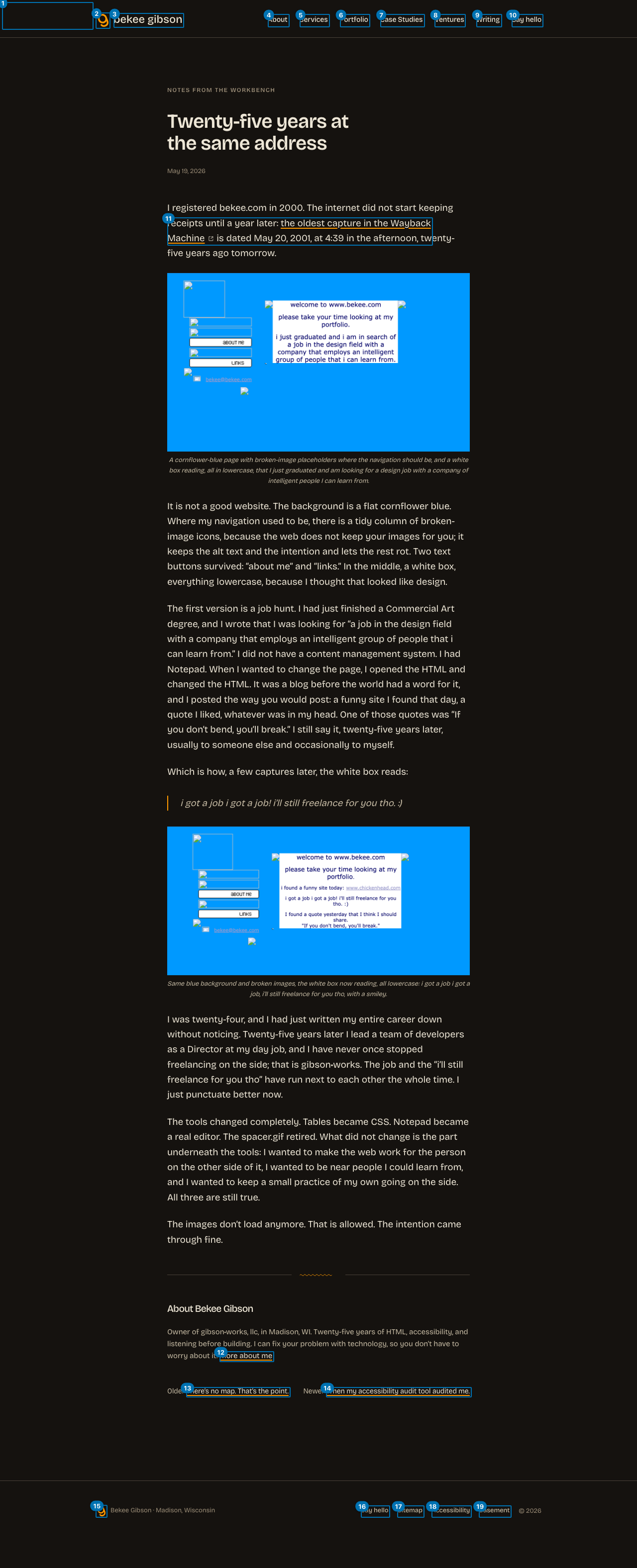
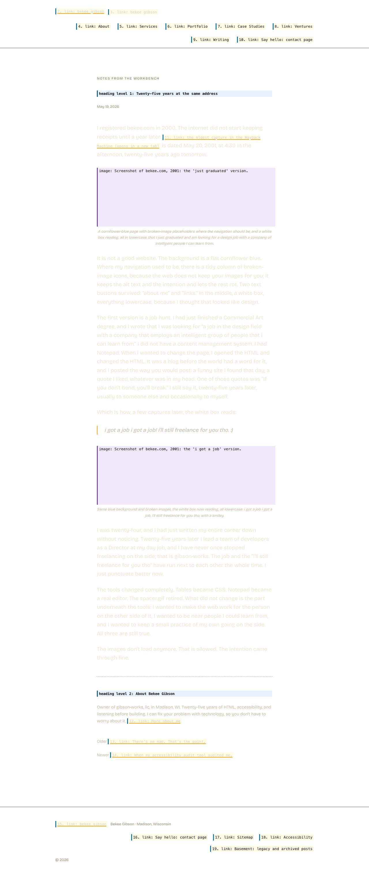
What we found: bekee2001-grad.png (alt "Screenshot of bekee.com, 2001: the 'just graduated' version."); bekee2001-job.png (alt "Screenshot of bekee.com, 2001: the 'i got a job' version.")
Keyboard and focus order (19 stops)
This is the only lane that drives the page instead of reading it: we pressed Tab and recorded where focus actually landed, until it wrapped. Roles and names come from Chrome's own accessibility tree, the same computation it hands a screen reader. A keyboard user passes 10 stops before reaching main content, and the page has a working skip link.
Nothing in this lane is a failure. The keyboard order was walked end to end and the deterministic checks came back clean.
The links list, as a screen reader user gets it 19 links, 16 distinct names
Screen reader users navigate by pulling up every link on the page at once (Insert+F7 in NVDA and JAWS), stripped of the layout that surrounds them. This is that list. Read in place a link can borrow meaning from the heading above it; read here it has only its own name.
Links
All announce as
3
bekee gibson
2
Say hello: contact page
Names appearing more than once, most repeated first. A repeated name is not automatically wrong: a "Home" link in the header and the footer is fine. It matters when the destinations differ and the name does not.
Heading outline, as announced
h1 Twenty-five years at the same address
h2 About Bekee Gibson
What this looks like on the pageEvery keyboard stop, numbered in the order focus actually visits it. Red marks a stop that is itself a problem.The same layout, showing what is announced instead of what is rendered. Hatched areas carry nothing for a screen reader user: background images, decorative graphics, and media with no text alternative. Interactive elements show the name Chrome computed; everything else is an illustrative approximation, not a finding.